At last year’s Genrecon one of the undoubted highlights was a snark presentation of covers given by Sarah Wendell of Smart Bitches, Trashy Books. Of course her particular focus was the Romance novels, an easy target perhaps for snarking, what with Fabio and man-titties (as opposed to man-boobs) and various other such tropes. It came to me though that Fantasy was as easily lampooned, the Hooded man, the enthroned King, the busty and poorly armoured warrior woman.
Covers are vitally important, despite the old adage that does not bear repeating. Perhaps in the ebook market this is less true, as opening a new ebook usually will take you to page one rather than to a cover, but with the flood of product a good cover is still an effective way to draw clicks to your Goodreads, or Amazon, or Kindle store presence.
I was surprised to hear from published authors how little control they had over the covers with which their novels appeared. I did here some anecdotes of cover artists communicating with the author, or perhaps even reading the book, but these were told as exceptions, remarkable precisely because they were not the rule. In some cases the author hated the cover which the publishers used.
Some years ago my sister recommended a book to me:

This is (I think) the 1997 edition.
On the back cover, below the blurb, there’s an image of a white wolf running through the snow.
Here, I thought, is everything I hated about Fantasy.
The swordsman in black, the black warhorse, the snowy castle, the raven…
Could these images look more hackneyed and clichéd?
It looked terrible.
I read a chapter or so in case she asked me about it, then it was shelved.
Some years later I found this book in a book store:

This is the 2003 edition under the Voyager imprint.
There’s a few extra endorsements, as over the intervening years and sequels Mr. Martin’s work had gathered a following and some rave reviews, but they’re mostly the same.
The blurb is much better on this than on the original, and I’m certain that that played a role in my selecting it too.
I bought it and began reading it without ever making the connection to the book my sister had given me.
It was only when I was several chapters into the book, and hooked, that I started to make connections with the earlier book I had shelved (or in fact, by that time, boxed-up and stored under the stairs).
For five years I had ignored a great Fantasy novel because of its cover.
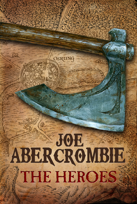
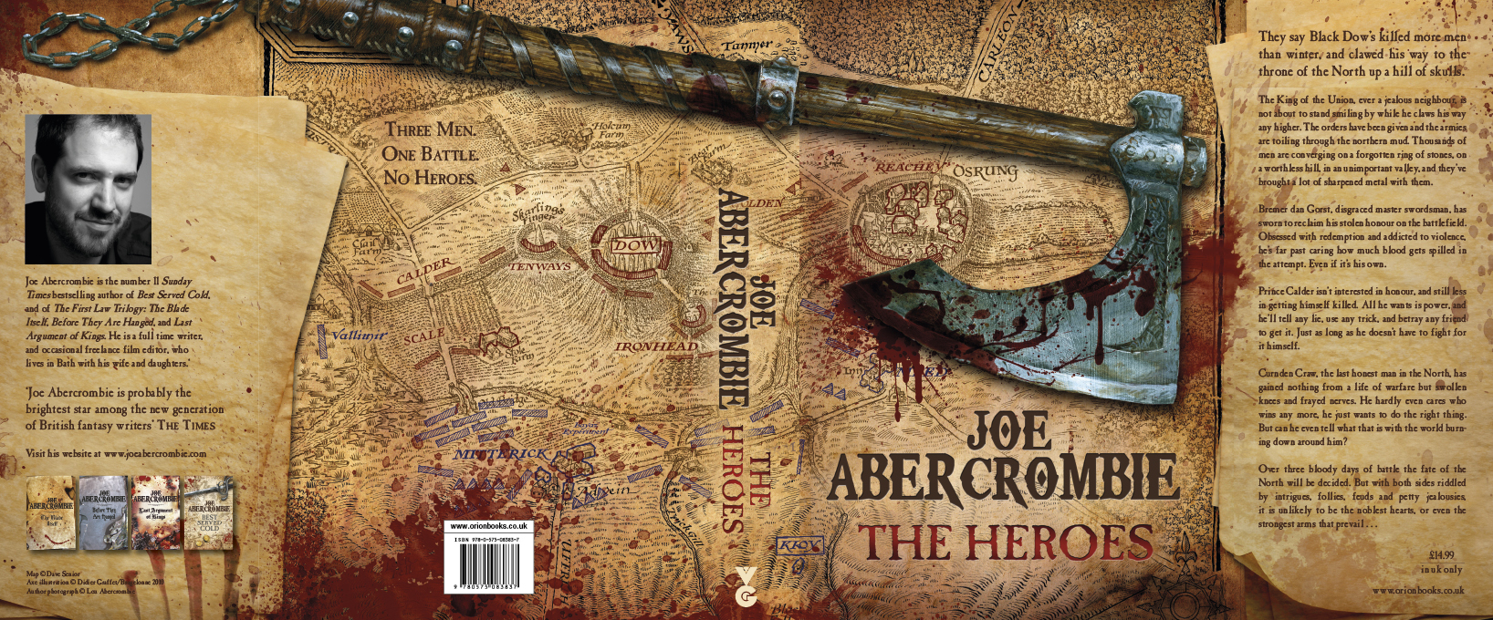
Another example of a cover leading me to great fiction is Joe Abercrombie’s The Heroes
I had a voucher to a bookstore sent to me as a Christmas gift, and I went in to buy China Mieville’s collection of short stories “Looking for Jake”, but I had some money left over and no real plan so I browsed the shelves.
Abercrombie’s views on maps have been well explained, and he included none in his First Law trilogy (which also have great covers), but this cover (as with the covers for “Best Served Cold” and “Red Country”) manages to convey I think a very real sense of Abercrombie’s world and the style of Fantasy he writes.
I like them far more than the hyper-real close-ups of the US covers.)
I bought it, loved it, and went back through the First Law and “Best Served Cold” in a matter of weeks.
Here’s the jacket of Heroes in all its glory (click the image to enlarge):
Recently the author Mark Lawrence responded to some suggestions comparing his cover for King of Thorns to GRRM’s Game of Thrones (specifically the Sean Bean cover that was released to tie-in with the success of the television series)
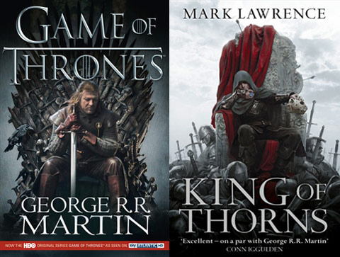
Lawrence’s response was to refer to similar covers back through the history of genre and still being released:


His point of course is well made. The mere similarity of having your protagonist (if Ned is the protagonist) sitting a throne is as much a part of Fantasy as the heroine swooning in the strong arms of her hunk is a part of Romance.
It’s always tempting of course to judge these covers. Whether they are examples of the best the genre has to offer, or some of the worst covers in the history of literature, there’s no denying their effect. It was suggested that the success of Fifty Shades of Grey in breaking beyond the Erotic Fiction market and into the mainstream was (in part) because it didn’t look like a typical Erotica cover.
It’s also worth acknowledging that the covers do not always reflect or represent the novel in the way the author would wish though, so in the interest of dispelling that hoary old cliche and admitting that of course we all do judge books in this way I invite you in the comments to nominate others.
What covers have made you pick up a book you went on to love?
What covers have drawn you to a book that you hated?
What covers have chased you screaming away swearing never to inflict such rubbish upon yourself… at least until they repackage it?

February 3rd, 2015 at 2:27 pm
[…] expect from a fantasy world, though it could be medieval as well. Though some might think it “hackneyed and clichéd,” I like the old cover more. It sets a scene, invoking a world to imagine, and especially in […]